 PMW
LOREVYA Beauty
Presenting LOREVYA Beauty's skincare in a clear, easy-to-browse store.
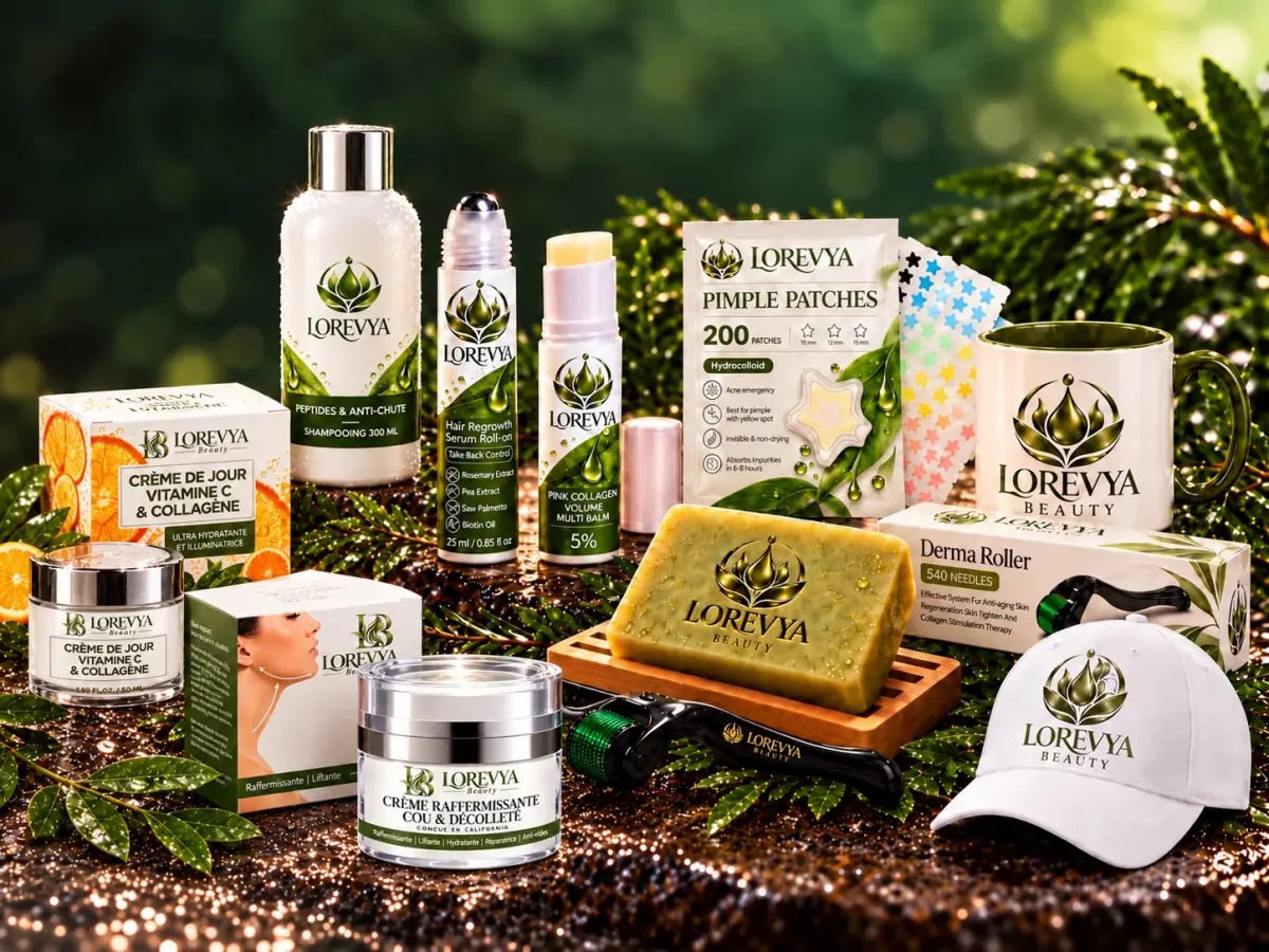
LOREVYA Beauty brand visual, used here to illustrate the project.
The project
LOREVYA Beauty is a cosmetics and skincare brand. It uses white packaging, olive green and visuals that showcase the products.
The challenge
Give the store a consistent identity and make every product quick to find, on desktop and on phone.
The work shown
- Art direction and consistency of the visual world
- Presentation of products and collections
- Content hierarchy and calls to action
- Graphic variations for communication
Creative approach
The visual identity draws on natural codes and a coherent product world. The pages put products first and give quick access to their product pages.
The images illustrate the project's graphic world. They are not presented as screenshots of a live site. No figures for traffic, sales or conversion are claimed without verifiable data.
A project to imagine together?
Tell us about your business and the website you would like to create.